
Few graphic designers can claim that Metallica called their work “awesome” - but Andie Airfix is one of them.
His “Graphic Art as an Extreme Sport” exhibition at Brighton’s Dynamite Gallery was not only an opportunity to get up close and personal with iconic images, but also a chance to discuss the changing face of music and design with an artist who’s just about seen it all.
“What exactly do you mean by extreme sport?”, I asked Andie, referring to the title of the exhibition.
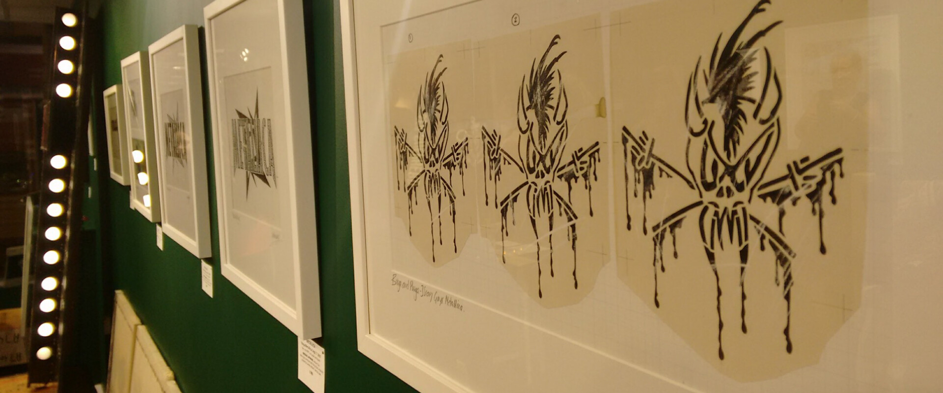
Every inch the rock’n’roller in his studded leather jacket, Andie gestured to the wall opposite, festooned in framed prints of Metallica’s ninja star design. “Well, Metallica are pretty extreme for a start,” he laughed.
Indeed, the works on show represent some of music’s most shocking artists from across the decades.

A pair of rhinestone-encrusted boots gleam beneath a brightly-coloured print of Little Richard. A backlit crucifix bearing Bowie’s fragmented face sits alongside Metallica’s horned ‘scary guy’. A homage to Sid Vicious built from scaffold and barbed wire looms across the room from understated portraits of Led Zeppelin.
This is a history of art at its most provocative - or as Andie puts it, “art that does not match the sofa”.
And yet there’s a comforting familiarity to it. After all, these are images we’ve seen on album sleeves, T-shirts and posters across the decades.
These are the logos that have been scrawled on schoolbooks in black biro and burned into our collective memory.
Andie’s challenge isn’t just creating iconic images that will stick with music fans for life. He also puts a lot of consideration into how the images will be used, combining form and function seamlessly.
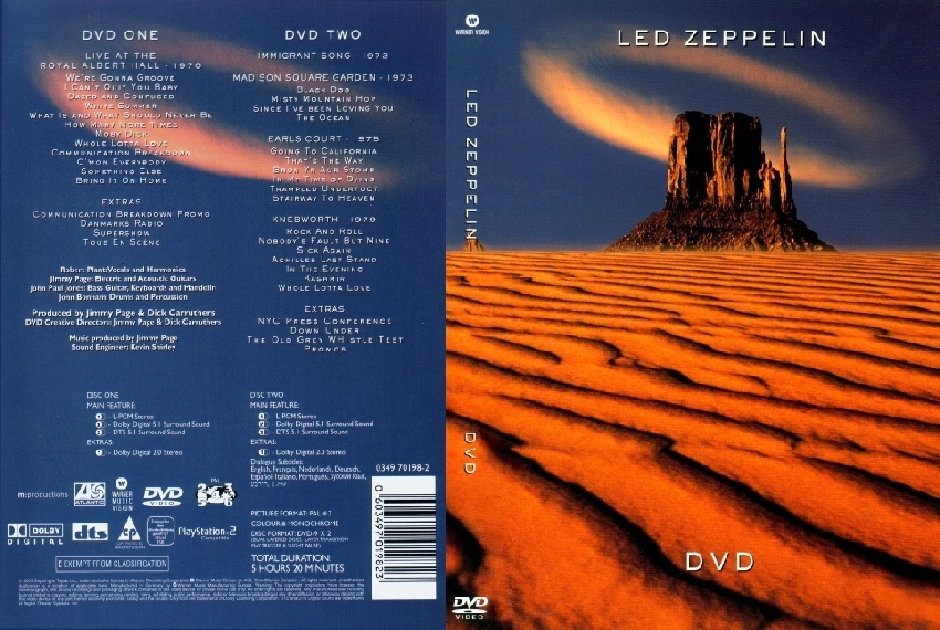
I was drawn to an A1 print of the artwork for Led Zeppelin’s DVD. The dramatic desert landscape in shades of red and blue is instantly evocative, and wouldn’t look out of place on my living room wall.

The picture’s ratios are far from just aesthetically pleasing, however - they’re designed specifically to wrap around a DVD case.
The near-identical DVD-sized print is testament to how strictly proportioned the image is, with the landscape’s features snaking around the spine, ensuring that the finished piece is instantly recognisable whether viewed on its own or lined up on a shelf.
Amongst the polished giclee editions are diamonds in the rough: drafts and works in progress, mounted alongside the finished products.
A framed print of Def Leppard’s logo bears the legend ‘Hysteria’ across it in black pen and Tippex - an appropriately rock’n’roll reminder of a world before Photoshop, when band logos were designed with the very same tools that fans used to replicate them on notebooks and patch jackets.

I was particularly transfixed by a large piece of graph paper on which Andie had blocked out the cassette cover for Dead or Alive’s Nude, including specific instructions to the printer as to how each element should be positioned.
The cassette insert itself was mounted underneath, demonstrating just how much was achieved before design went digital.
“We took that one to City College,” Andie told me, “and the kids couldn’t get their heads around how we’d done it all without computers.”
It’s not just the tools that have changed when it comes to graphic design in the music industry. Andie has also seen a movement away from the days when musicians and artists could discuss album artwork one-on-one.
He told me about a project he’d worked on for Paul McCartney, and how none of the photos sent by the record company were quite right for the design. “I finally got hold of Paul and gave him my opinion,” Andie recounted, “and he said, ‘I’m glad you said that, I thought I was going mad!’”
This insistence on discussing design artist-to-artist is certainly a part of what makes Andie so enduringly unique in his craft, and a good lesson to designers in any field. Taking the time to understand a client’s ideas, ethos and personal tastes is crucial to representing them.
So what did we learn?
“Graphic Art as an Extreme Sport” isn’t just a slice of heaven for music lovers. It’s a crash-course in the iconic status that graphic design can achieve, melding seamlessly with the cutting edge of culture until it’s virtually inseparable from the music it represents - or the era it defines.


If you want to showcase your offering, convert more leads, provide resources, or all of the above, we can build a website that separates you from the competition.


