
The UK’s 2017 snap election has been an unusual one, to say the least.
We take a look at the data gathered by Google in the run up to election day to see if the SEO data has anything to say on the election's outcome.
As the party campaigns began, most pundits and polls saw Theresa May’s much-desired Brexit mandate as likely to be served on a silver platter. As the election drew nearer, however, that mandate looked harder and harder to secure.
With polls having made the wrong calls in previous close-run contests, and nobody liking experts anymore, it’s time to turn to modern technology for extra clues.
Google have been running a Trends page throughout the election campaigns, providing an insightful look into our political search habits.
Here’s our breakdown of the how the main parties have fared as brands:
In terms of which party is most searched for, the rankings are:
Obviously, this order doesn’t match poll averages, but it does reflect the momentum Labour have shown with their recent growth in popularity. If the polls can’t be completely trusted, this is at least clear corroboration of Labour’s rise.
If parties are brands then their leaders are their products. The following timeline shows the past seven days of search interest in each leader.
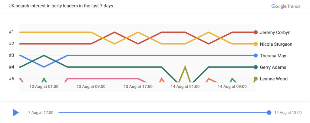
The patterns are fairly clear, Corbyn dominates the top spot for most of the past week.
But the trend here doesn’t match the trend for the parties. Nicola Sturgeon of the SNP isn’t in the 5th slot that her party holds, but instead dukes it out with Tim Farron between 3rd and 4th.
There hasn’t been anything to disrupt the 2-party status quo for over a week. Sturgeon, Farron, and at times Nuttall and Lucas may be swapping positions, but Corbyn and May have had their own battle above them.
However, Google lets us dive deeper to an even smaller scale - the BBC’s election debate.
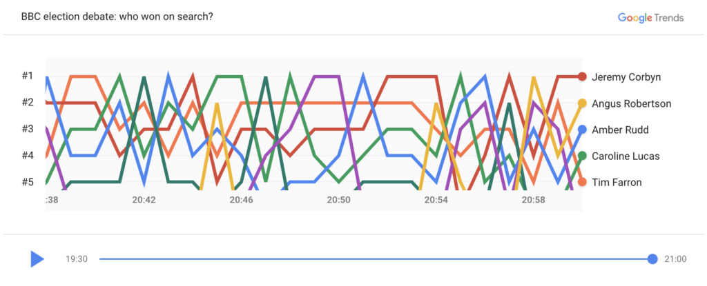
This is as close as we can get to tracking interest in each leader based on their strength in the debate alone, without the influence from parties shown over wider 7-day search rankings.
In this case, Amber Rudd and Angus Robertson appeared in place of their respective leaders. This makes an immediate difference, with Corbyn having a much harder time retaining the top spot, often vying with Amber Rudd.
This suggests that the conservatives can field two people capable of holding the public’s interest, Theresa May and Amber Rudd. While a lot of questions were raised as to why Theresa May wasn’t at the debate, this wasn’t reflected in her search popularity.
The SNP couldn’t pull off the same trick with Nicola Sturgeon and Angus Robertson. Angus Robertson barely appears on the chart, with few people interested in him and the SNP during the debate.
In fact, the SNP dipped below the #5 slot, leaving a space for Caroline Lucas to slip in. The most surprising aspect of the chart is Lucas’ six moments in the #1 spot. As the Green party’s sole MP, this says a lot about her influence with the public.

Google also lets us explore which questions are being asked about the election, when a search query features a party by name.
Searchers appear certain that this is a two-horse race, with the Conservatives and Labour both having popular questions asked about whether they will win. No other party has this question.
Both also have ‘why vote [Conservative/Labour]?’ questions, and Labour even features a ‘why not vote Labour?’, perhaps a little incredulously. This may be indicative of a search by a swing voter.
The next four parties all share a question too: Who is their leader? This is a disconcerting search term to see ranking so highly, suggesting that the average voter doesn’t have immediate access to even the most basic information about competing parties.
This being said, the Greens have a popular question in which Caroline Lucas is mentioned by name: Is Caroline Lucas vegan? Despite its search popularity, this is not a pressing electoral issue.

The past week has seen the UK struck by terrorist attacks in London and prior to that in Manchester. It’s a topic that has dominated the news, with coverage of what happened, stories of the victims and survivors and tales of British solidarity in the aftermath.
Due to these events, election campaigns have been paused twice and leaders have found it harder to give other topics time when pressed by the media for their response to such terrorism.
The search results, however, don’t mirror these current events, the top contenders being:
The last two may have indirect connections to recent events, but neither ‘terrorism’, ‘defence’ nor ‘policing’ are on the list.
Finally, there are some interesting trends in the related queries that users have been searching for when looking at specific parties.
When people searched for Labour, they then also tended to search for:
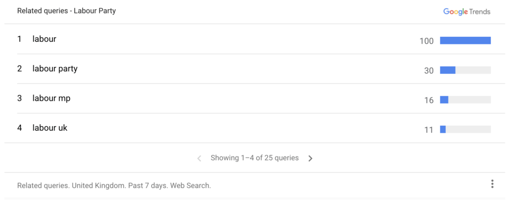
Here we see a lot of interest in the Labour manifesto, and even some in the Conservative manifesto.
For the Conservatives, on the other hand:
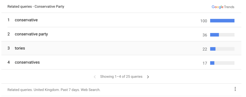
We’re seeing a lot more interest in the Labour manifesto after the party’s own. This suggests that the 22% search interest held by the Conservatives may be even weaker than the 51% that Labour hold.
What’s lacking from Google’s analysis are the all-important age bands. Polling companies can poll a nationally representative demographic. Google can’t say the same, however.
Their results come from whoever uses search the most, and this is heavily skewed towards younger generations. Google’s data will even include those not registered to vote or too young to vote.
Google does suggest a heavy leaning towards a Labour victory, but if search interest were to be weighed directly against voting intention polls, this would be an incredibly bold statement.
What Google’s data does perhaps show, however, is how younger audiences are likely to vote - if they’re able to!


If you want to showcase your offering, convert more leads, provide resources, or all of the above, we can build a website that separates you from the competition.


